
Client: Adnami (adnami.io)
Duration: 3 mo.
Role: Product design, UX/UI
Goal: Redesign advertisement campaigns editor and management platform used by top tier advertisers and brands.
Outcome: Most of the users reacted very positively for significant platform improvements.
I was invited to redesign platform used by advertising agencies to manage creative campaigns for over 1000+ brands across several EU countries. During my preliminary meeting with Adnami’s management team, I consolidated project requirements and committed to formulating a detailed redesign strategy.
01. Project scoping and design process planning
Stakeholders as industry professionals, offered profound insights into the product’s intricacies and user needs.
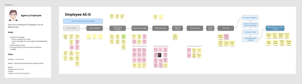
Initial phase was to conduct in-depth interviews with each stakeholder separately, focusing on understanding the platform’s user flow and journey. With open-ended questions goal was to extract genuine user pain points, insights, and potential improvement or challenging areas of the platofrm.
This feedback was carefully collected on a Miro board, reviewed, prioritised and converted to improvement opportunities.
02. UX audit of existing solution
During next stage I performed heuristic evaluation and UX review of existing solution, to identify key improvement areas and challenges to solve. New user flows and requirements were formalised during iterative team review sessions.
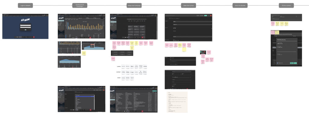
User pains identified:
- Users can’t see final result before they click Save button, which require a lot of back and force actions, require time and decreasing user satisfaction.
- Users missing preview when trying to select template to start with.
- Users struggling with messy forms structure, and misleading indication of system state.
- Commercial creative export process is require too many manual steps.
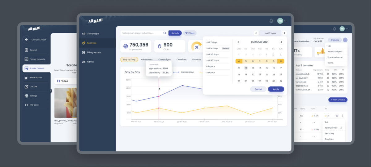
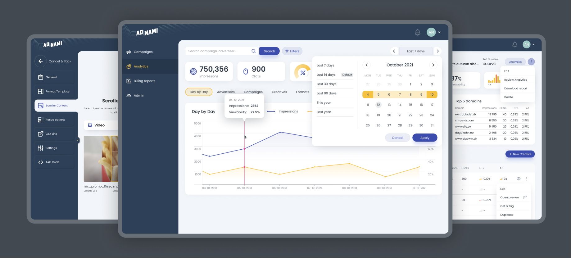
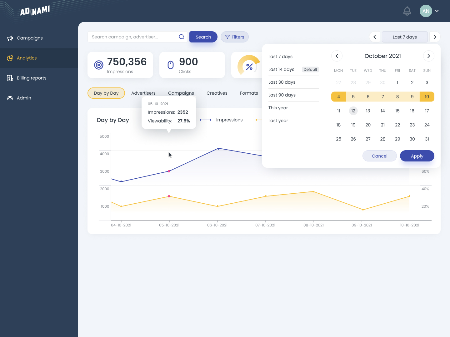
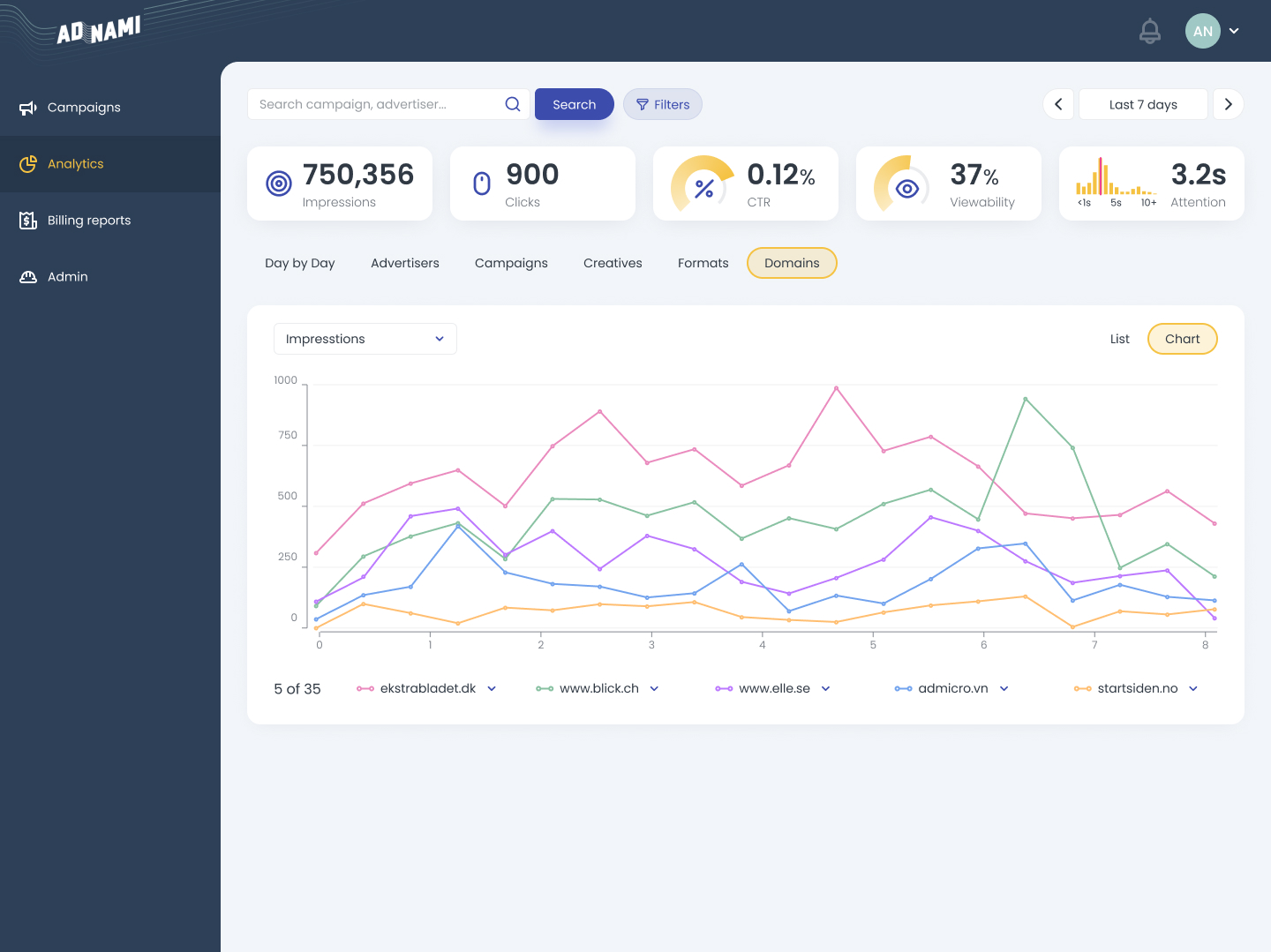
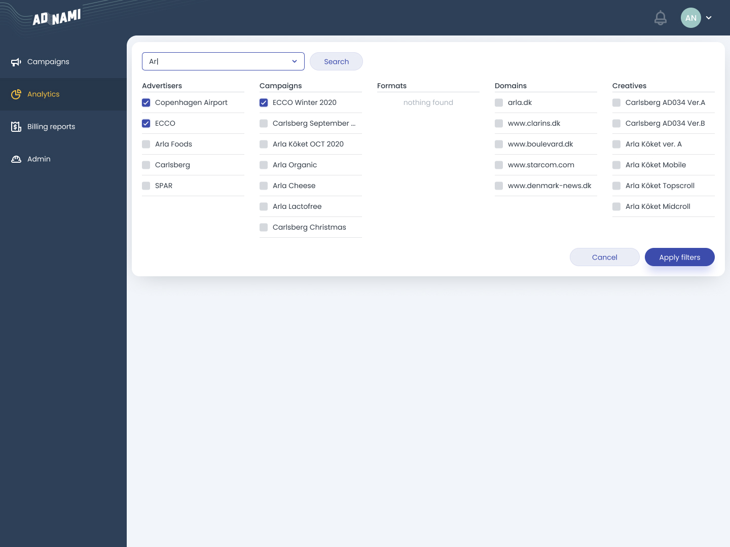
- Existing analytics possibilities do not cover all user needs.
03. Competitive analysis and industry leading UX patterns research
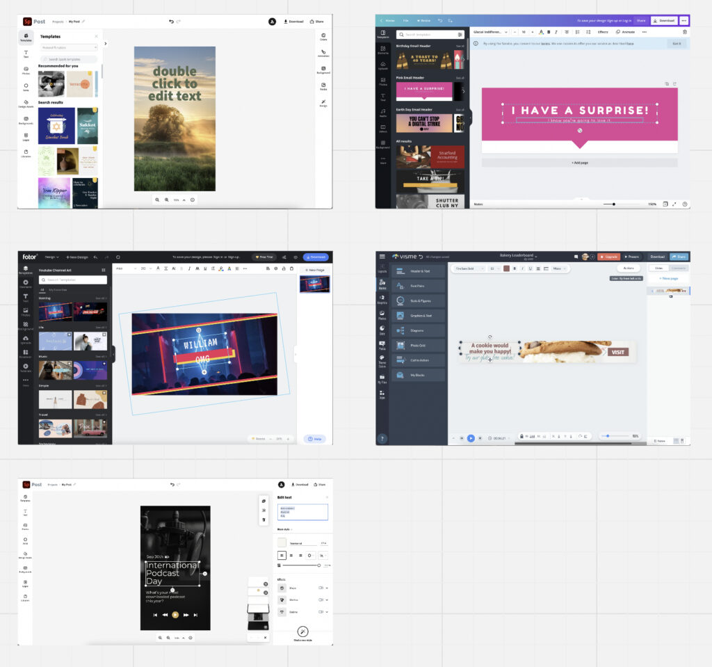
Identification of existing UX patterns “native” to the industry was an important step, as main goal was not to invent completely new banner editor interface, but make solution simple to use by anyone, based on best practices in similar products.
04. Solutions
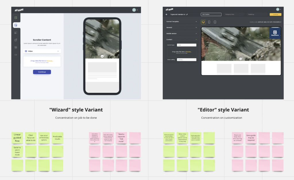
Solution 1 – We need wysiwyg banner editor
There was two main concepts for banner WYSIWYG editor, linear wizard style and advanced editor concept. Linear wizard was chosen bases on pros and cons evaluation during workshop I facilitated with extended team group review.
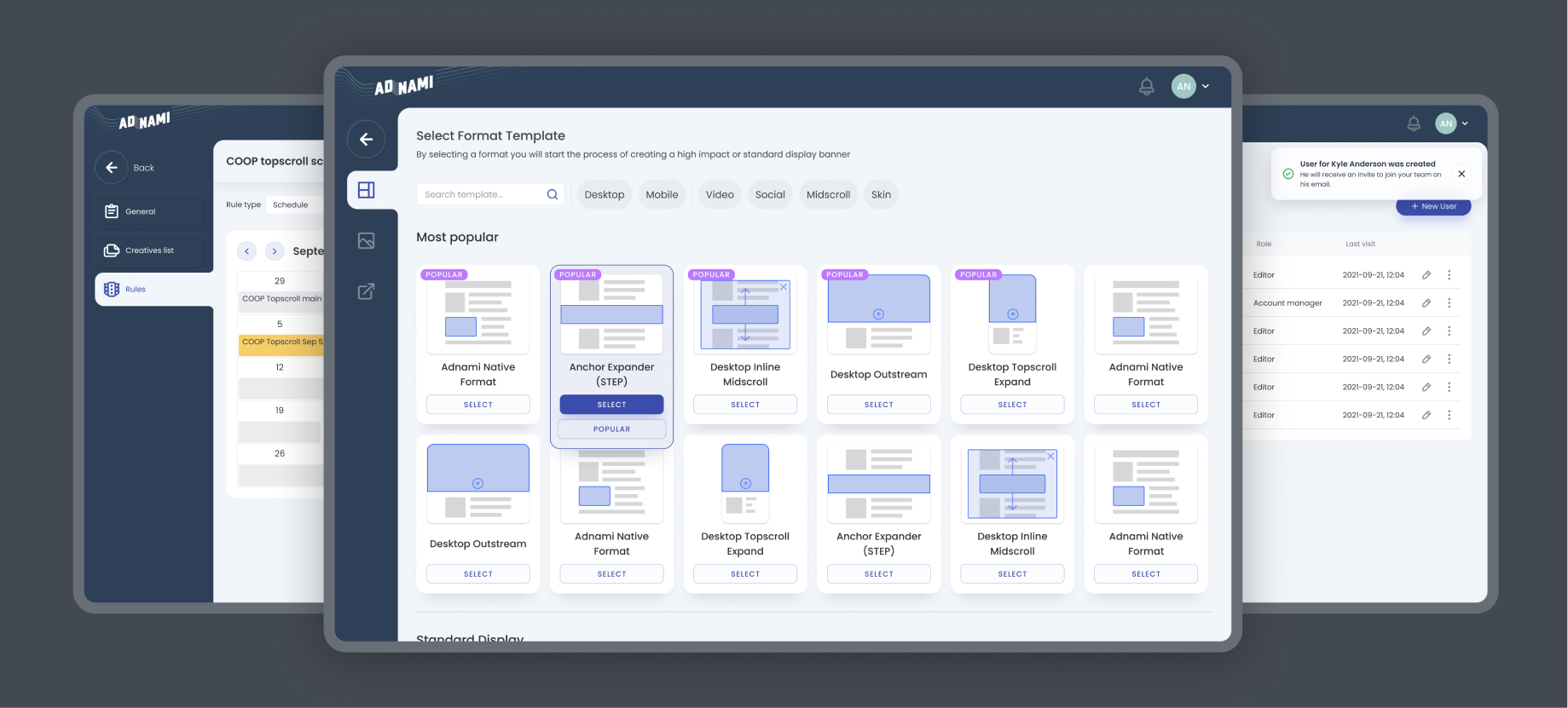
Solution 2 – universal visual representation of templates
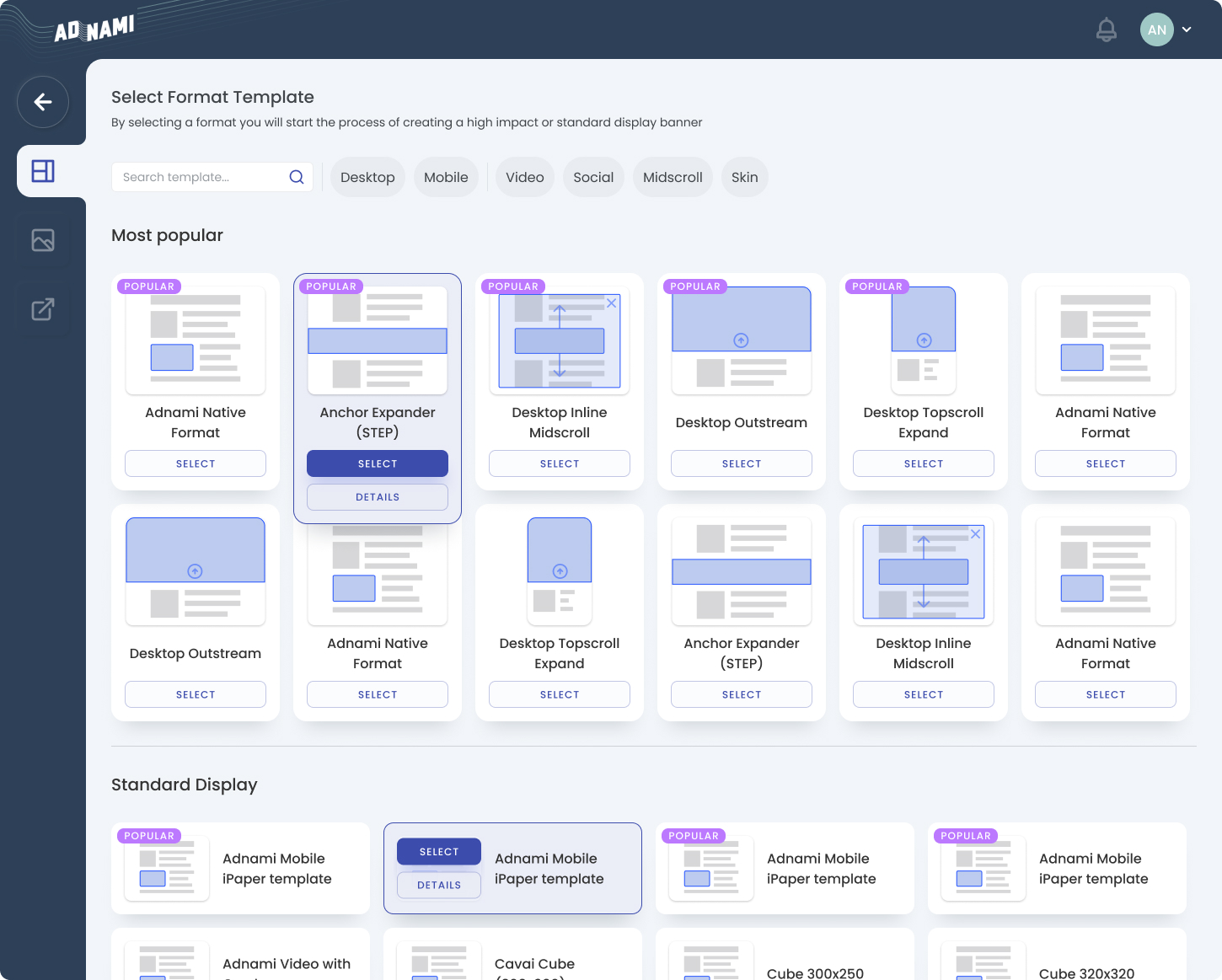
- Reviewed creative selection page have layout preview thumbnails, with own visual language but still very simple to extend and create new ones without involving graphic artists.
- Template details screen and link to example preview was added, so its even easier to select template which will fit user needs.
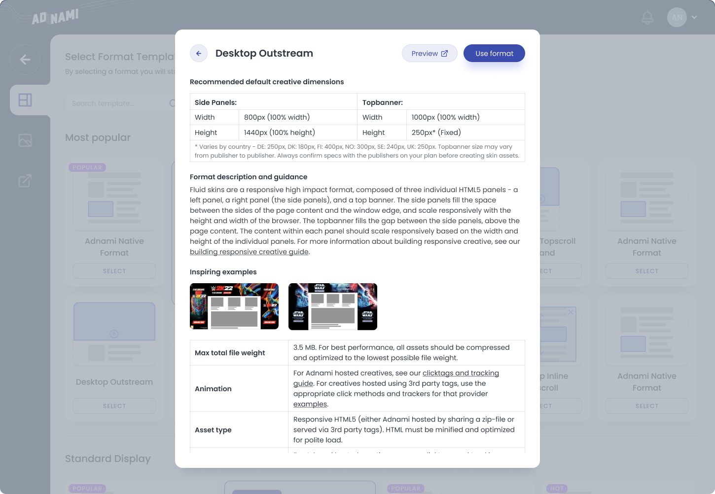
Solution 3 – Improved UX for all components
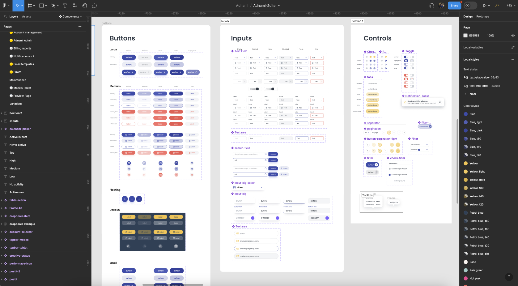
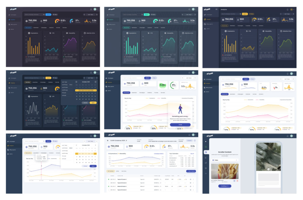
All UI components, forms, dialogs was reviewed for usability and converted into new consistent design system. Target user persona mainly was a desktop user, but during research we found that some functionality may be useful on mobile also, so mobile version was added.
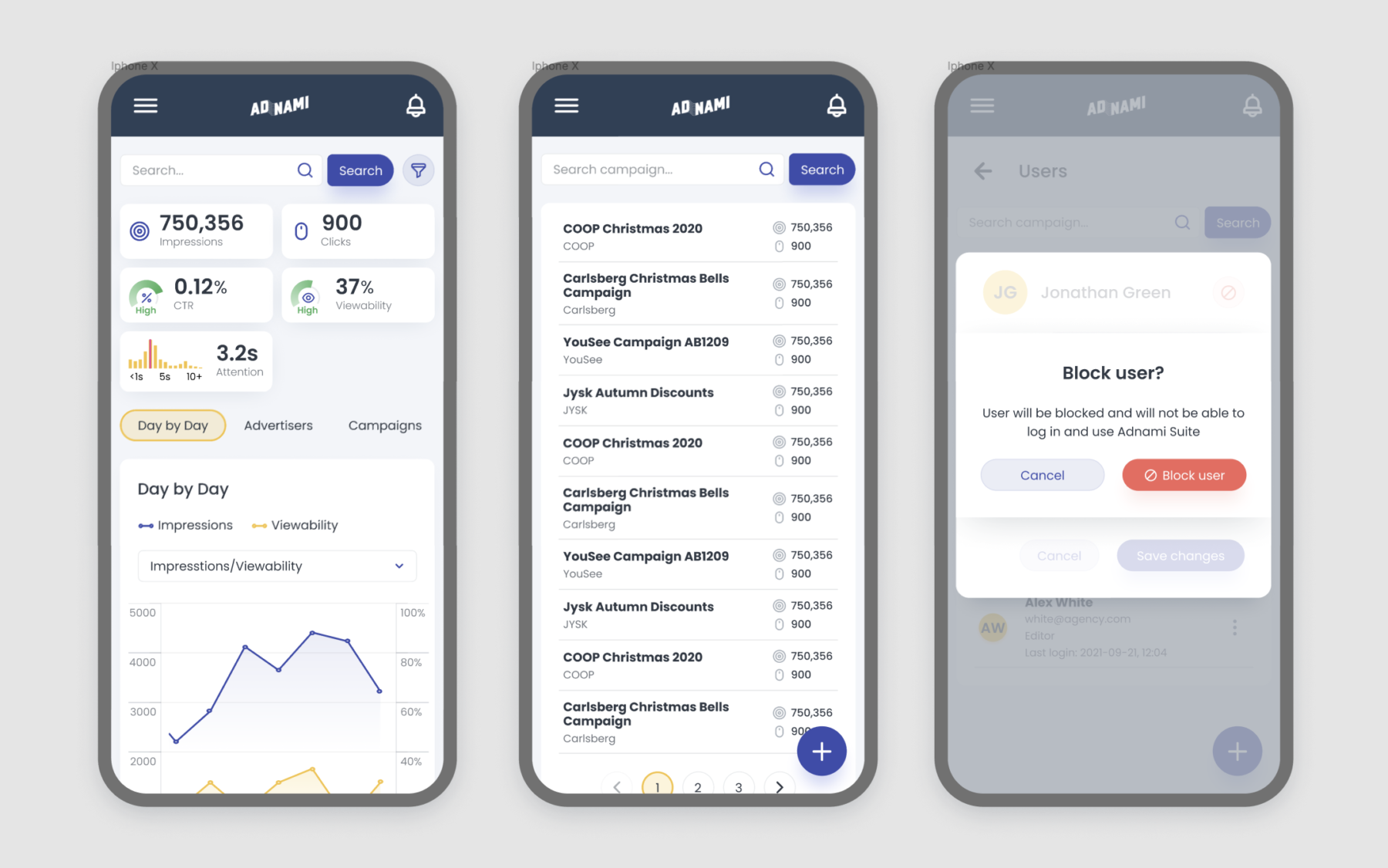
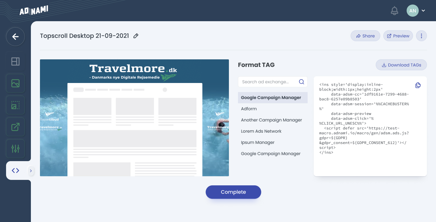
Solution 4 – New page for exporting
As a result of campaign creation, agency manager need to receive a generated code snippet. Initial process was just a file downloading. Now user have single page for all things that he need: copy code, preview resulting campaign, share the link with co-workers or his customer.
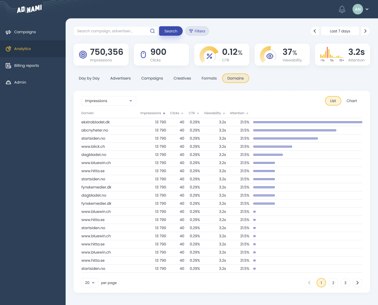
Solution 5 – improved analytics and reports
05. Decisions around UI styles update
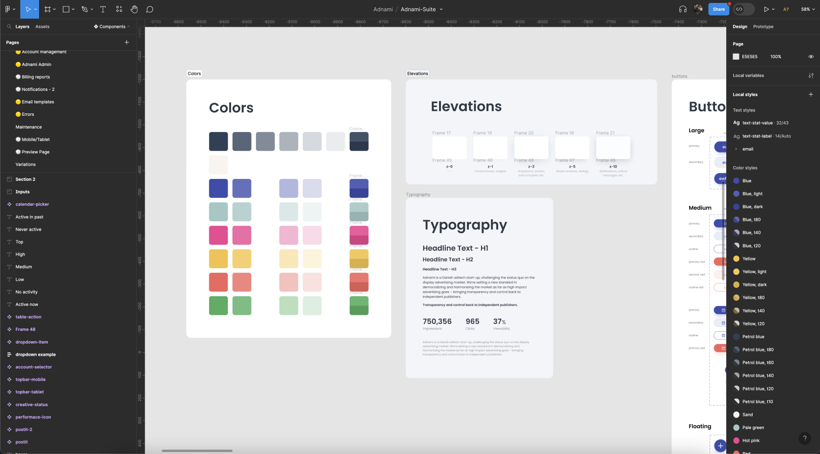
While the platform’s UI needed modernization, the company emphasized maximizing resources for enhancing user experience over aesthetic overhauls. Consequently, I bypassed the wireframes phase, instead devising a user interface grounded in my vision and the company’s branding guidelines. This approach prioritized user experience, directing resources effectively.
06. Discussing, testing, iterating
Upon crafting a prototype featuring revamped user flows and navigation, I spearheaded review sessions with managerial and sales personnel, those directly interfacing with customers. Their invaluable feedback was assimilated for further refinement.
Subsequent iterations entailed liaising with developers to ensure design feasibility.
07. Outcomes
- Visual banner editor feature decreased the need to involve 3rd party contractors which not only save money, but also shorten pipeline when publishing campaigns. Which is a critical metric for agencies who works with well-known top-tier brands and managing hundreds of campaigns across different countries at the same time.
- Agencies received access to a better analytics data to understand how campaigns are running, including A/B testing functionality.
- Improved overall usability increased B2B customers satisfaction.